Stutern Housemanship — Handout Documentation by Abodunrin Victoria

TASK 1 — IMPLEMENTING OF REACT-ROUTER-DOM
Overview
In React, the page contents are created from components. So what React Router does is intercept the request being sent to the server and then injects the contents dynamically from the components we have created. React Router provides routing capabilities to single-page apps built, helps to route/navigate components in the single page app. React Router is published from implementing React-Router-Dom npm package.
Step1 — Install React-Router-Dom
To install React Router, all you have to do is run npm install react-router-dom@6 in your project terminal and then wait for the installation to complete.
If you are using yarn then use this command: yarn add react-router-dom@6.

Step 2— Setup React Router
The first thing to do after installation is complete is to make React Router available anywhere in your app. To do this, open the index.js file in the src folder and import BrowserRouter from react-router-dom and then wrap the root component (the App component) in it.
This is what the index.js looked like initially:

After making changes with React Router, this is what you should have:

All we did was replace React.StrictMode with BrowserRouter which was imported from react-router-dom. Now the router features are accessible from any part of your app.
Task 2 — Building the Sign up / Create Account Page
A signup page is one of the most common forms on websites . The use of Signup(create account) and Sign in forms are common on websites to collect the details of visitors. These days, every site uses registration and login forms to maintain authentication.
With a Signup form, users can create an account and can enjoy private space on applications, whereas a Login form validates your presence in the system while presenting you with a variety of alternatives to see and process.
In this article, we’ll learn how to code the signup page that has been designed on figma.com.
Setup
This project being a team work, you need to first synchronize to have the last work pushed on the repo on your local environment. Then, install all packages by running the command below in your terminal.
npm i or npm installBuilding the form
Step1 — Create the Sign up component
Navigate to the Signup.js file which has been created, this is where we want to create our signup page. Forms are often defined within the <form> tag in both traditional HTML code and in ReactJS. This form component, like any other HTML form, includes the labels, input fields(First name, Last name, Email, Mobile, Password, Re-enter password), submit button (continue button)
Furthermore, all this form attributes also have properties like “htmlfor”, “className (this initially entails our tailwind css styling” , “type (text, email, password”), etc.
Step2 — In the Signup.js
I Created the sign up form which entails the user inputs for Last name, first name, email, mobile, password , confirm password, re-enter password , the continue button and the link to Login.
Step3 — Stying with tailwind css.
I then proceed by styling the page with tailwind css i.e inserting the styling properties in the “ className ”.

Step 4 — Creating the password visibility eye icon( show/hide)
The basic idea is to change the input tag’s type attribute to text from password and vice versa on clicking the eye icon button.
import React, { useState } from "react";// import the svg images from the assests folder (the eye icons)import showPwd from "../assets/svg/show-password.svg";
import hidePwd from "../assets/svg/hide-password.svg";// Initialize a boolean stateconst [pwd, setPwd] = useState("");
const [pwdConfirm, setPwdconfirm] = useState("");
const [isRevealPwd, setIsRevealPwd] = useState(false);
const [isRevealConfirmPwd, setIsRevealConfirmPwd] = useState(false);

Step 5 — Run the command below in your terminal and test the page on your localserver
npm start
Step 6 : Creating the mobile view design.
This was achieved using the tailwind css. Majorly by giving the the size the mobile screen size so as to appear responsive.


Task 3— Implement layout and functionality for logging out
step 1 — Import useNavigate from React Router
Step 2 — Add the useNavigate hook in the beginning of the component file
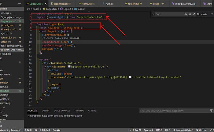
Step 3 — A Logout function
A function that handles the logout button when clicked. This redirects us back to the landing page once the user logs out.
Step 4 — The logout button (onClick) takes the function as its value
This initialize the functionality of the Logout button to direct users to landing page

Task 4— Implementation of layout and functionality for Account Overview page
Step1 — Create the Account Overview page file.
This is .js file named AccountOverview.js , this is where I write the layout code and functionality code for our Account Overview page.
Step 2 — Import the header component
I imported the header file which as been designed earlier , this is the header part of the website , where we have the navbars and enclose it inside our code.
Step 3 — Divide Page segments into responsive div tags.
The Page is initially divided into four. The account Overview (text segment), my account, my items which contains a grid list items , footer buttons , each divs also have sub-divs which is used to style all its children .
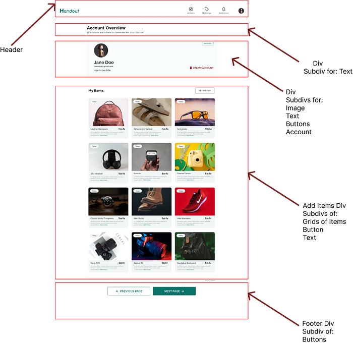
Step 4 — Putting into the div containers its elements and styling it into the required layout using tailwind css. Checkout tailwind documentation on how to achieve this .

Step 5 — Create the layout for the add items using the tailwind css grid layout and also implement the functionality to add items to this layout using the JS.map function.
 <div className="mt-6 grid grid-cols-1 gap-y-[30px] gap-x-[24px] xs:grid-cols-2 md:grid-cols-3 xl:gap-x-8 mx-[15px] ">
              {products.map((product) => (
                <div key={product.id} className="group relative ">
                  <div className="h-[200px] w-full overflow-hidden rounded-t-lg bg-gray-200 group-hover:opacity-75 lg:aspect-none lg:h-80">
                    <img
                      src={product.imageSrc}
                      alt={product.imageAlt}
                      className="md:h-[150px] w-full object-cover object-center xs:h-full lg:h-full lg:w-full"
                    />
                  </div>
                  <div className="flex justify-between min-h-[87px]  w-full rounded-b-lg bg-[#F1F6F6] ">
                    <div>
Step 6 — Working on the page’s buttons click event.
On clicking the edit profile button it directs users to the EditProfile page where users can edit their profile.
<div className="flex justify-end my-[20px] mr-[20px] text-center">
              <button
                type="button"
                className="flex items-center justify-center w-[100px] h-[30px] leading-[15px]  px-[10px] bg-transparent hover:bg-[#077369] text-[#077369] font-Raleway font-[600] text-[10px] hover:text-white py-2 border-[1.5px] border-[#5da39c]  rounded"
                onClick={() => navigate(NonAuthRoutes.EditProfile)}
              >
                Edit Profile
              </button>
            </div>
On clicking the delete button a dialog pop up shows on the page.
I created this using react useState hook to handle the show modal state (popup). This event was passed to the delete button onClick
import React, { useState } from "react";
const [showModal, setShowModal] = useState(false);

Step 7 — Designing the modal popup (DeleteModal.js file)
The DeleteModal is then passed into the AccountOverview.js file to handle the Delete button on click event, this appears as showModal.
{showModal ? <DeleteModal closeModal={setShowModal} /> : null}

When users click on the “NO” , it takes off the pop up. When the “Yes” is clicked, the user is then directed to the account successfully deleted page
 <div className="flex items-center justify-center p-6 border-t border-solid border-slate-200 rounded-b">
              <button
                className="text-[#077369] background-transparent font-Raleway font-500 uppercase px-10  md:px-14 py-2 text-sm outline-none focus:outline-none mr-5 mb-1 ease-linear transition-all duration-150  rounded border border-[#077369]"
                type="button"
                onClick={() => closeModal(false)}
              >
                No
              </button>
              <button
                className="bg-[#077369] text-[#FFFFFF]  font-Raleway font-500 uppercase text-sm px-10  px-14 py-2 rounded shadow hover:shadow-lg outline-none focus:outline-none mr-3 mb-1 ease-linear transition-all duration-150"
                type="button"
                onClick={() =>
                  navigate(NonAuthRoutes.DeleteAccountSuccessfully)
                }
              >


